
How the concept sites were made.
Four concept businesses, four different jobs to do. For each one: the brief we set, three decisions that shaped the design, and what the page weighs on a phone.
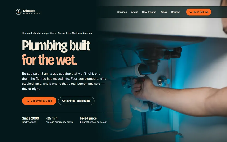
01 Trades · Cairns
Saltwater Plumbing & Gas
The brief
A plumber gets work when the phone rings, often at 3 am with water on the floor. The site had one job: get a stressed person to call, fast, and trust the person who answers.
Three decisions
- The call button never leaves the screen. It sits in the header on every page and every scroll position, so the number is one tap away whatever the visitor is reading.
- A 24/7 strip for the night it goes wrong. An orange band says who answers right now and what to do first if there is gas. It speaks to the emergency caller without scaring off the bathroom-reno customer.
- Suburbs and drive times, not a map. A plain list of suburbs with typical drive times answers "do you come to me, and how soon?" faster than a map, and loads in a fraction of the size.
- First load on a phone
- 262 KB
- Files to open the page
- 9
- Trackers and cookies
- 0
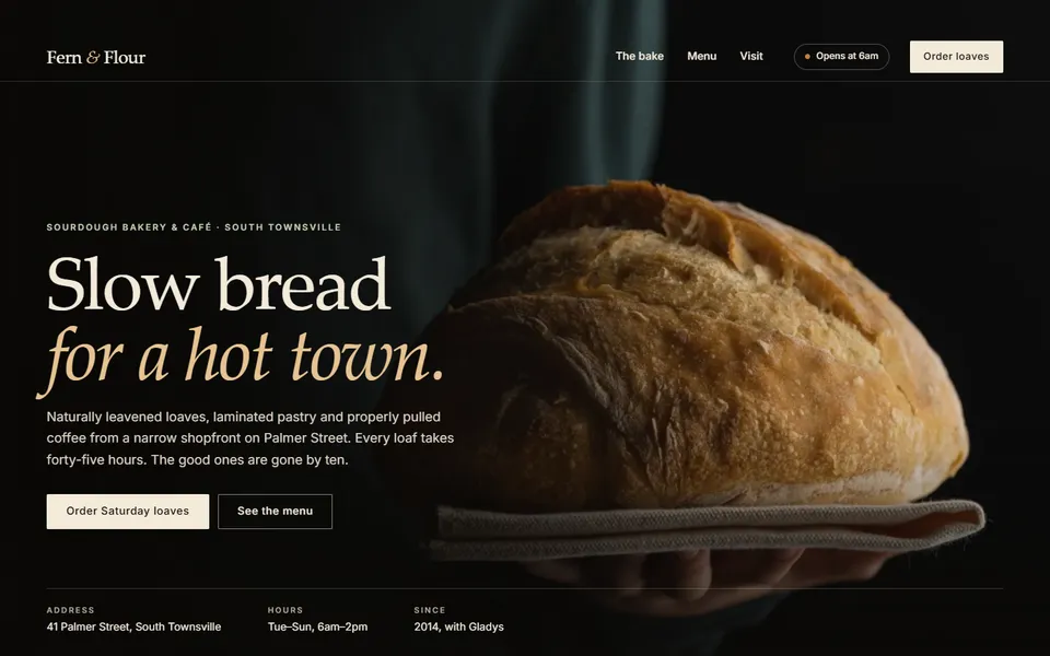
02 Café · Townsville
Fern & Flour
The brief
People look up a bakery to answer two questions: is it open, and what is there today. Everything else is mood, and the mood should feel like the shop: warm and unhurried.
Three decisions
- A sign that knows if the shop is open. The "open now" sign reads the opening hours against the time in Queensland, so nobody drives over to a locked door.
- The menu first, with prices. The menu sits near the top, item by item with prices, instead of a PDF or a photo of a chalkboard that cannot be read on a phone.
- Order Saturday loaves ahead. A simple pre-order, capped per loaf, turns the busiest morning into orders the bakers can plan for.
- First load on a phone
- 139 KB
- Files to open the page
- 8
- Trackers and cookies
- 0
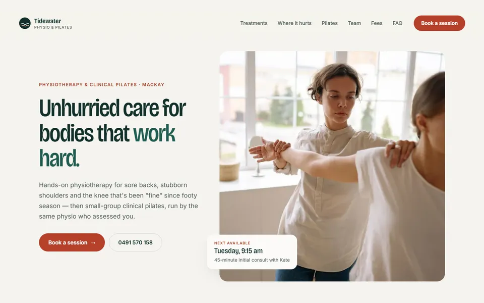
03 Clinic · Mackay
Tidewater Physio & Pilates
The brief
Someone in pain wants to know two things: can these people help with this, and when can I get in. The clinic also wanted fewer phone calls just to book a time.
Three decisions
- Tap where it hurts. An interactive body map lets a visitor tap a shoulder or a lower back and see how the clinic treats it, in plain words rather than a list of techniques.
- Book without picking up the phone. A short day-then-time booking flow with a clear confirmation. It works the same at 360 pixels wide as on a desktop.
- Calm and clinical, never cold. Soft greens, generous spacing and photos of real treatment rooms keep it trustworthy without looking like a hospital form.
- First load on a phone
- 248 KB
- Files to open the page
- 9
- Trackers and cookies
- 0
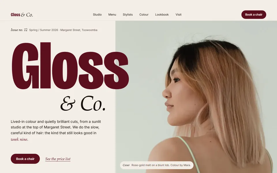
04 Salon · Toowoomba
Gloss & Co.
The brief
A salon sells a feeling, then a booking. The site had to look as considered as the work in the chair, and still make the prices and the booking easy to find.
Three decisions
- Styled like a magazine. Large photography, an editorial serif and chapter numbers give it the confidence of a printed lookbook.
- A colour bar before you book. Visitors pick one of eight house shades, read who it suits, then book that colour by name. It starts the conversation the stylist would otherwise have in the chair.
- Prices and stylists in the open. A full price list and a card for each stylist, with what they are best at and a "Book with" link, take the guesswork out of choosing.
- First load on a phone
- 327 KB
- Files to open the page
- 12
- Trackers and cookies
- 0
These are concept businesses, designed and built by Galix Studios to show the range. The names, people and reviews are made up; the websites are real and work on any phone. Weights were measured on the live sites over a phone connection, photos included.